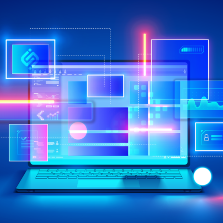
Product | January 29, 2024
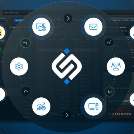
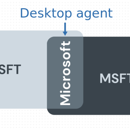
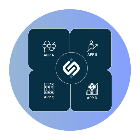
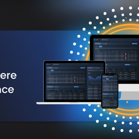
Interoperability Everywhere All at Once In this post, learn how the concept of “interoperability everywhere” extends workflows across all devices — phone, tablet, or desktop. Traders can walk away from their workstation and continue tasks from anywhere.